Original Artworks by Dree-Louise Finch
You can follow my personal Instagram page to keep up to date on future artworks as well as my upcoming exhibition.
_________________________________________________________________________________________________________________
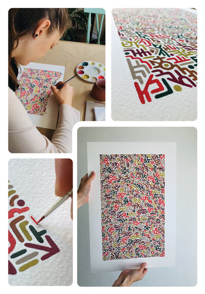
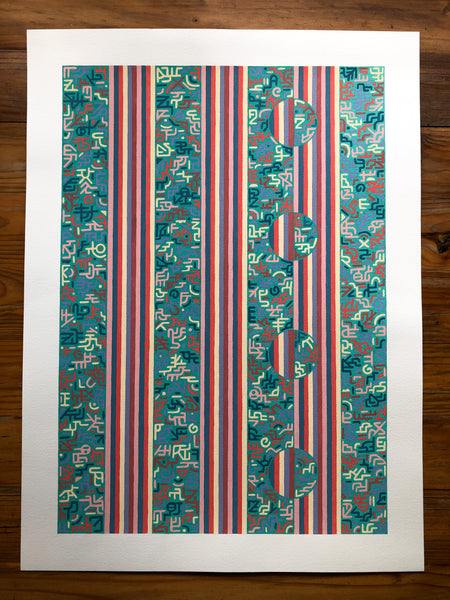
This entire creative journey started with these little 12cm x 12cm doodles. I loved them so much and instantly knew that I wanted to do this on a larger scale, and dived right into my first A1 artwork - Intentions.
Every shape is intuitive and free-flowing but somehow becomes super intentional, as I work to fit the next shape in with the last. It’s like a jiggsaw puzzle that I’m putting together on the paper. The colour palettes I choose have a big impact on the finished work as well.

65 hours later...


__________________________________________________________________________
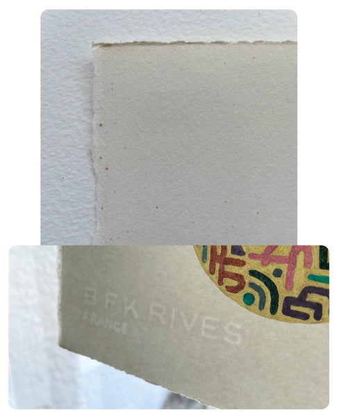
The paper used for this piece is mouldmade in France. If you hold the paper up, you’ll be able to see the watermark in the bottom left corner. I definitely wanted to do something different on paper as special as this! It also has some age spots which adds to the charm of this piece.
I love the raw edges and the sound of my paint brush sweeping back and forth on this beautifully smooth, soft textured paper had me feeling so satified!
* BFK were the initials of the owners of the Rives mill in France at the beginning of the 19th century - Blanchet Frères & Kiebler.
I worked with seven colours in this piece. Each shape has its own background colour with 6 alternating fill colours. I got such a different vibe from painting each shape purely due to the colour changes.
I loved it!
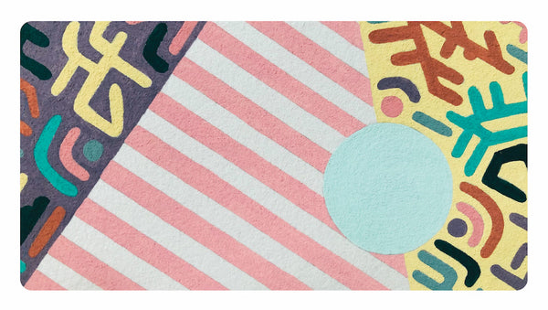
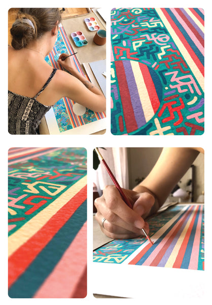
I looked forward to painting this pink pin stripe from the very beginning and when I finally started on it, I knew I was getting close to the end, after spending hours on the four big shapes. The final touches were to add the bold black stripe circles which makes this piece really pop!
It’s the perfect combination of playful and obscure!

__________________________________________________________________________

__________________________________________________________________________
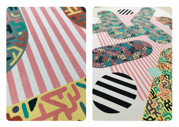
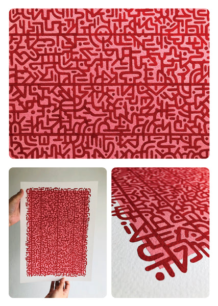
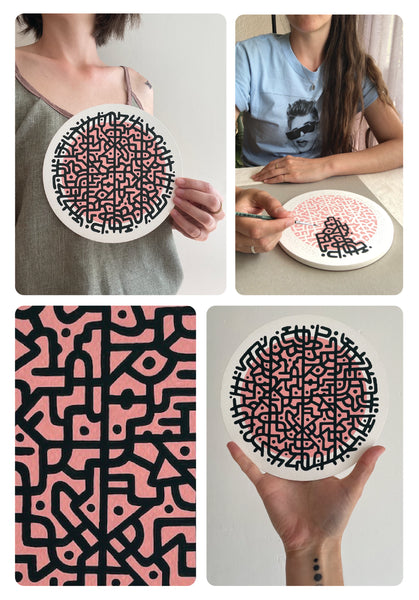
Pink and red make so much sense together! It’s super appealing on the eyes making it one of my all-time favorite colour combos, and I couldn’t wait to put this cool idea I had in mind onto paper!
Unlike my previous pieces where I drew hundreds of individual shapes, this piece would be one continuous, maze-like pattern. I would only need to work with two colours... Perfect!
Drawing this piece took me quite long as I had to visualise how each part connects with the surrounding parts. I used my eraser just as much as my pencil, as I doodled my way across the paper, connecting everything together to create this awesome unified pattern.
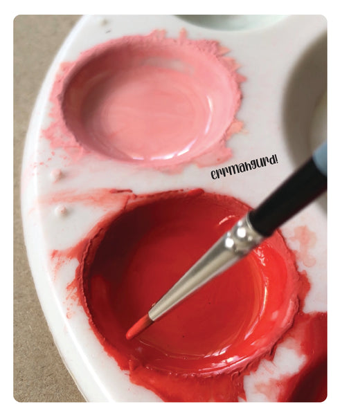
Painting it was fun too. I painted the entire background page pink and then went in with red which was kinda scary to be honest!
SO TOTALLY WORTH IT THOUGH!


__________________________________________________________________________
Left Overs was created quite literally with all the left over paint I had from the previous pieces I had completed. I hate washing away paint that I can still use, and all my palettes are currently still full of paint which I’ll use up in future artworks.


__________________________________________________________________________
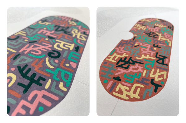
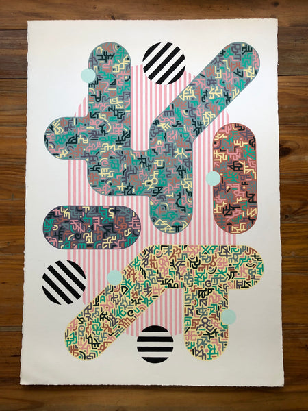
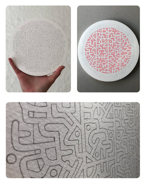
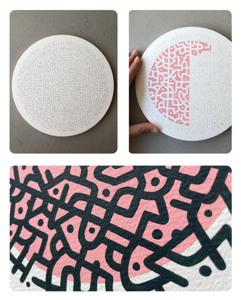
I knew that this continuous maze-like pattern would work so beautifully on this round paper and I obviously had to do a version of it in the pink and red colour combo!
These were so much fun to do, and also a lot easier to pack away when I wasn’t working on them, especially in a small space like ours.


__________________________________________________________________________
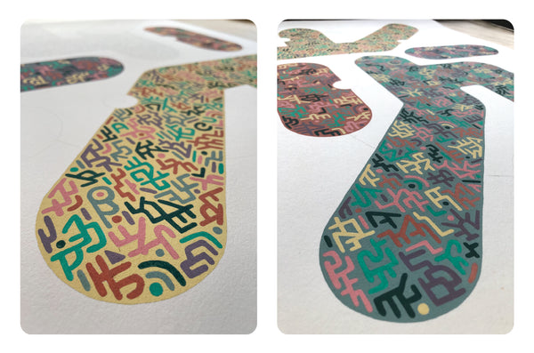
Another colour combo that makes me wacky is pink and green. I went with the darkest shade of green I possibly could, it almost looks black to be honest. I love the contrast, it looks like a proper map, hence the name Search Location.
I enjoyed working on these smaller pieces. I felt recharged and ready to move onto larger pieces again.

__________________________________________________________________________
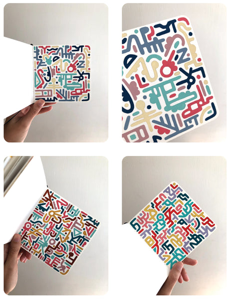
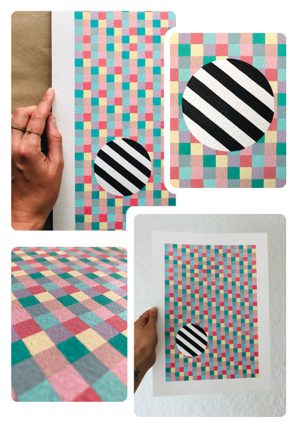
This piece was inspired by my retro baby blanket. The colours clash but strangely also compliment each other very well. I wanted this piece to be bold and playful,
and I think that’s exactly how it came out!


__________________________________________________________________________
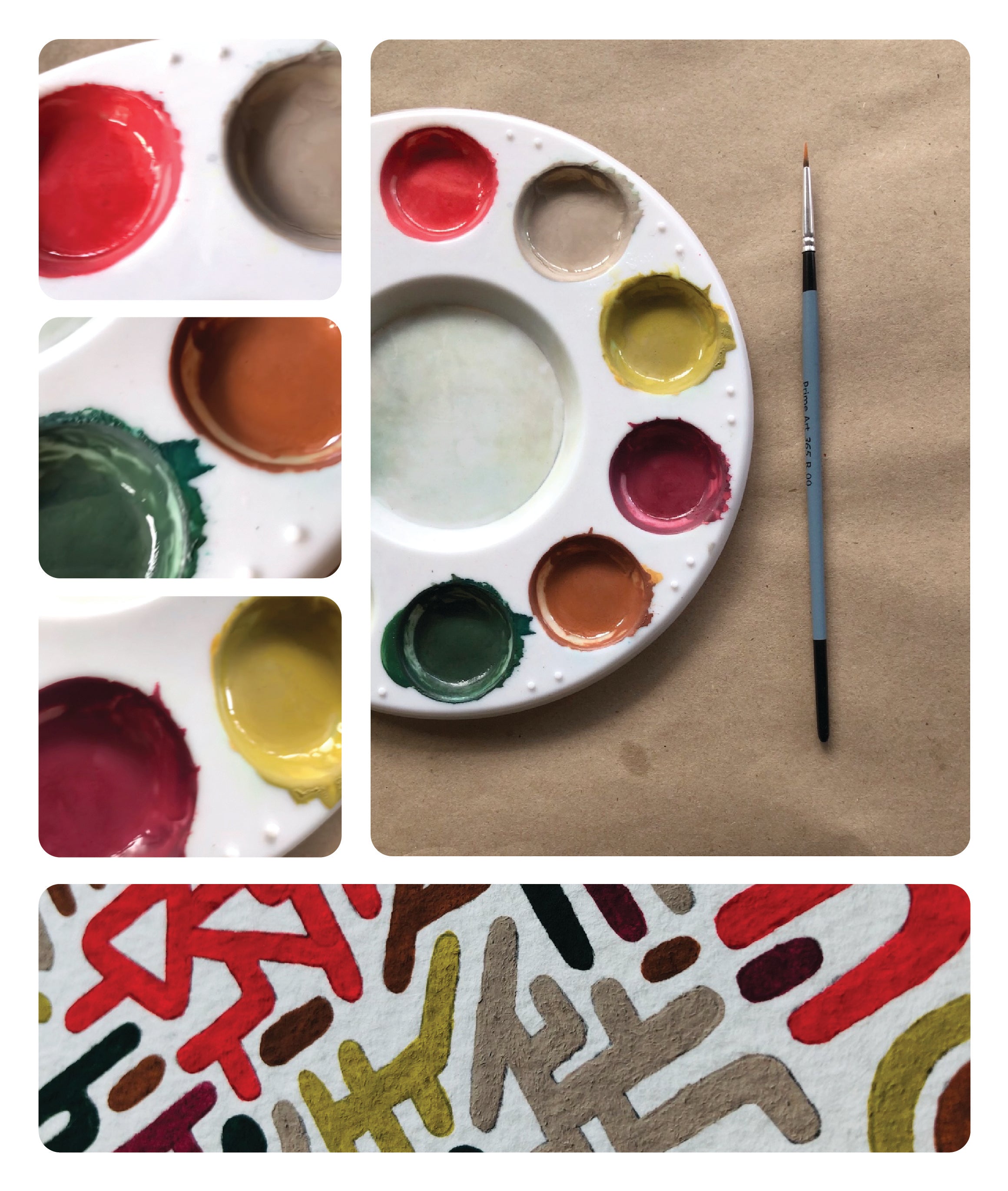
I was gifted a few sheets of this vintage handmade paper which was slightly discoloured.
I wanted to embrace and celebrate its age and instantly envisioned simple line work with a soft retro colour palette.
516 lines later... I was ready to mix my six colours and I came to the conclusion that I needed a clutch pencil for future works.


__________________________________________________________________________
More artworks will be coming soon.
You can follow my personal Instagram page to keep up to date on future artworks as well as my upcoming exhibition.